http://www.boredpanda.com/funny-dear-blank-please-blank-letters/

Wednesday, 30 November 2011
Unusual Slide House in Japan


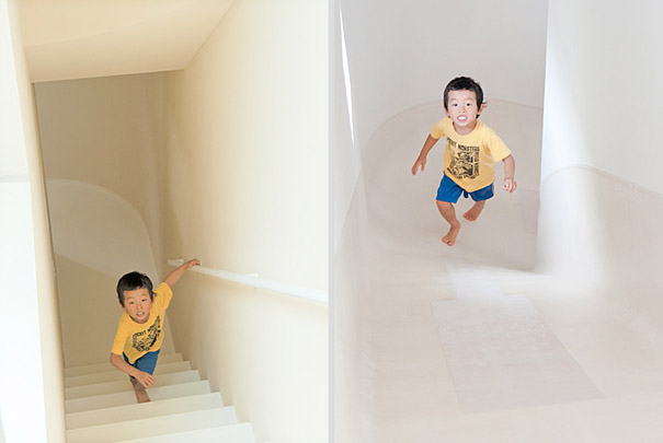


Japanese Studio LEVEL Architects has designed an unusual three-story family house quipped with a slide that connects all three floors. This fun house is wrapped with staircases and a corridor on one side, and the slide on the other side, which together form a circular route around the central area of the house.
The 1,762 square-foot Nakameguro home is located in Meguro-ku, one of the municipalities of Tokyo, Japan.http://www.boredpanda.com/slide-house-in-japan/


Andy Garcia Joins Dark Light Pictures as a Commercial Director

HOLLYWOOD—Andy Garcia has signed with Dark Light Pictures for representation as a commercial director. In his debut with the company, Garcia has directed a campaign for Whirlpool and Buenos Aires agency Madre that will air across Latin America and South America.
Although best known for his work in front of the camera, Garcia has a number of credits as a director in television and film, the latter including The Lost City, a 2005 film (in which he also starred) about a Cuban nightclub owner whose family becomes embroiled in the violent transition from the dictator Bautista to Fidel Castro. His alliance with Dark Light, however, marks his first foray as a director of commercials.
Dark Light Pictures executive producer Vince Arcaro believes that Garcia has great potential as a commercial director. “Andy has had an opportunity to work with and learn from many great directors—Francis Ford Coppola, Sydney Lumet—and cinematographers—Gordon Willis, Conrad Hall Sr.,” observes Arcaro. “He is a very seasoned director who brings a lot of knowledge, experience and creativity to the set.”
In addition to directing the campaign for Whirlpool, Garcia also acts in the commercials, playing all of the parts. The commercials offer humorous takes on common family situations and show how Whirlpool appliances help people enjoy life more. In two of the spots, Garcia plays a mother and a father engaged in kitchen and laundry chores. In a third spot, he plays a father and son planning a Mother’s Day gift. The campaign features the tagline “Better homes. Better lives.”

Tuesday, 29 November 2011
Monday, 28 November 2011


Friday, 25 November 2011
Tim Burton Balloon Debuts at Macy's Thanksgiving Parade
Tim Burton's "B.Boy" balloon was unveiled to the public Thursday as part of Macy's annual Thanksgiving parade in New York City.
The character's backstory is that he was cobbled together from rejects of birthday party balloons left over from children's parties at a hospital. B. Boy was not allowed to play with other kids so he withdrew to his basement home and into the world of his favorite film, The Red Balloon. He hoped that one day he too would be able to fly above the city and bring joy to one small child.
The blue B. Boy was a hit online, with one fan tweeting "My hero Tim Burton got his own float!? I actually teared up. Über dork alert:)" and another declaring "The Tim Burton balloon was my favorite this year." Film blogger Harry Knowles noted, "TIM BURTON BALLOON!!!! And He's there with Helena [Bonham Carter] and his kid and I have a really big smile. Love Macy's Parade."
The Paul Frank-created monkey Julius was also a new addition to this year's parade, which featured Spider-Man, Kermit the Frog, Mickey Mouse, Hello Kitty and Snoopy balloons and appearances by Mary J. Blige, Cee Lo Green and Avril Lavigne.


Thursday, 24 November 2011


McDonald's Billboard Lights Up Chicago Sky Leo Burnett looks heavenward
What light over yonder billboard breaks? McDonald's and Leo Burnett have built what is sure to be a beacon of hope for fast-food junkies and late-night drunks in downtown Chicago. The billboard, part of a regional "Best Fries on the Planet" campaign, is visible for some three miles around its location at North Clark and West Ontario. It's a pretty nifty concept, although it does bear some resemblance to Tribute in Light, the iconic installation consisting of 88 searchlights shone into the sky from the World Trade Center site. Instead of a somber memorial to a national tragedy, the McDonald's ad is a shining lure for the sloshed, stumbling and hungry. Call it Tribute in Fries. Couple more images after the jump.


Samsung Galaxy Campaign Brilliantly Slams iPhone Fanboy Culture New Spots Take on Apple's iPhone and Those Who Wait in Line for Them
Lots of Apple consumers carry a bit of shame over their seemingly illogical willingness to do silly things like, say, wait in line to pay Apple an exorbitant amount for a new phone. But rivals struggle to capitalize on that shame, regularly falling flat in their attempts to out-clever Apple. Samsung's new ads, however, capture the absurdity of fans' blind devotion to all things Apple. They were created by 72andSunny in Los Angeles, the same agency behind these Benetton ads. And here's the Facebook page for "Stop Waiting," created by Deep Focus.
Best lines:
"I could never get a Samsung. I'm creative."
"Dude, you're a barista."
http://adage.com/article/digital/samsung-galaxy-campaign-brilliantly-slams-iphone-fanboy-culture/231194/
Wednesday, 23 November 2011

Creativity Pick of the Day: Domino's Pizza, Fresh From Your iPad
Your iPad doubles up as a kitchen counter in "Pizza Hero," CP&B's new app for Domino's. You can knead dough, spread sauce, cheese and toppings and cut slices, competing against other players with scores based on time and quality. Or, just click "Make an Order" and place an order for your own creation on Dominos.com.
http://adage.com/article/creativity-pick-of-the-day/domino-s-pizza-fresh-ipad/231155/

Tuesday, 22 November 2011
Semiotics: A Powerful Communication Tool For Designers
There is an important thing present in advertising and other design uses, that we call semiotics. Actually, it’s present in everything in our lives, so deep that we don’t always pay attention and it happens naturally. So, what is this thing that surrounds us and is so important for design and advertising? The semiotics is the study of signs, and through them, it studies the origins of meaning in different languages of communication.
It goes deep into communication languages, verbal or non-verbal, to even understand why we think about the image of a rose when we hear the word “rose”. Why is this sound or theses letters connected to this object? What is the relation between them that makes the meaning? And more, why do we think about passion when we think about the rose? Though? Just a little, but we’ll talk more about it and show how to use this knowledge for communication and persuasion.
The three kinds are:


Let’s analyze a common object, some cell phone “icons”:
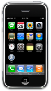
Here we can see some real icons (representation of the object itself) like the calendar, the camera and the clock. Also, some indexes (signs that have a connection with the object, but it’s not its real representation) like the stocks, You Tube or mail. If they were real icons, there should be a photo of a stock exchange, a thumbnail of a You Tube video and an electronic mail image. Finally, we see also a symbol, for Flash. There’s no visual connection from the Flash “icon” to the real meaning.
There’s no specific indication of what is that, but we know, because there’s a previous knowledge that Flash is an application for animations (ok, this image – flash – is not real, but useful for educational purposes). The designers who projected this screen were aware of the signs and its meanings, as we all shall be when designing anything. It is important because it’s the base for communication, which is the final purpose.
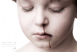
Let’s start with this clever ad about verbal violence (click to enlarge). The main element is the boy’s picture. So, you instantly think: “it’s an icon, because icons are real representations like photos”. Ok, but no. It is surely an icon, yet more than that. As we said that all signs can belong to the three kinds, this one is more symbolic. See, the boy looks upset, looking down, pale colors, showing sadness. These perceptions are primary indexes, because the eyes looking down, for example, is an indicator of sadness. BUT when we understand that this boy has suffered violence, it becomes symbolical and subjective.
The “words/blood” coming out from the boy’s nose is another index (indicating violence) that becomes a symbol. There’s no real blood, the written words are giving this idea, again, subjective. If I didn’t know what is this about I wouldn’t understand the image, it was important to have a previous knowledge about the concept “words hurt too”.
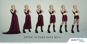
Here we see the same woman, with same hair and same position creating a totally different look only by changing the clothes, from opera style to punk rock style. Obviously, the main sign is the clothes, and again, symbols. There’s the convention that the first style of the woman (composed by a long red dress – all symbols in this ad) is more classic adequate to opera, while the last look is more rebel, according to the punk rock style (boots, pantyhose, mini skirt and top). The transition between them illustrates the concept “opera to punk rock mp3s”.
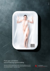
Now see this ad about prostitution. The main elements are a meat package and a woman inside of it. Why is this combination so strong? First, this kind of package is known as meat package, distributed largely in supermarkets, as a common commodity. When they put the image of a woman instead of the meat there’s a clear comparison with the woman – a prostitute – and a piece of meat. The woman becomes a symbol, provoking feelings like surprise, repulse, shock and impact. Nobody would like to treat a human being as a piece of meat, that’s when we read the concept “if you pay a prostitute, you’re financing human trading” and the whole idea clears up.
This article is just a brief view about semiotics and interpretations, the real thing is much more complex and complicated. We indicate some good books to go deep into semiotics concepts like “This Means This, This Means That: A User’s Guide to Semiotics” by Sean Hall, Theory of Semiotics by Umberto Eco (largely known name in semiotics) and Semiotics and the Philosophy of Language also by Umberto Eco. To conclude this article, there is a nice video that explains in an easy way some aspects about semiotics.
http://www.snap2objects.com/2009/07/03/semiotics-a-powerful-communication-tool-for-designers/
It goes deep into communication languages, verbal or non-verbal, to even understand why we think about the image of a rose when we hear the word “rose”. Why is this sound or theses letters connected to this object? What is the relation between them that makes the meaning? And more, why do we think about passion when we think about the rose? Though? Just a little, but we’ll talk more about it and show how to use this knowledge for communication and persuasion.
What do we need to know to make use of semiotics?
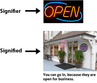
First, know what is a sign and its kinds. A sign is anything that makes meaning. Anything? Sure, if you see/hear something and understand that, it is a sign. They are the mediators to the world. According to Saussure, the signs have two aspects: signifier and signified. The first one is the material that has a meaning and the second one is the meaning. For example, the open sign is the signifier, while the signified is that you can go in.The use of semiotics in our lives
Now let’s see the kind of signs according to Peirce and then analyze some things in our lives on which we can see the use of semiotics.The three kinds are:
- Icons – a clear representation of the object itself, keeping its characteristics. There’s no distinction between the icon and the real object. Examples are: photos, drawings, imitations, onomatopoeias and others.
- Index – They indicate something. The index connected with its meaning (not arbitrary) but unlike the icon, it’s not the object itself. As examples, we can say that smoke indicates fire, smiles indicate happiness, fresh coffee smell in the morning indicates that someone preparing breakfast. Even medical symptoms and measuring instruments are indexes, because they indicate something.
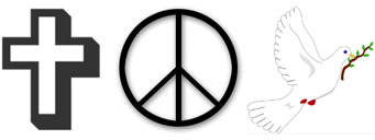
- Symbols – They have no resemblance to the real object, it’s a result of a convention. A symbol can only make meaning if the person already knows that, so, this is a matter of culture and previous knowledge. We all know that a dove represents peace, but there’s no connection between the animal and peace, it’s just a convention. Letters and words are examples of symbols. The graph sign (words) has no direct link to the thing itself, but for each culture, they make meaning. For us, the mourning is represented by the color black, but this color changes for different countries and cultures.
Let’s analyze a common object, some cell phone “icons”:
Here we can see some real icons (representation of the object itself) like the calendar, the camera and the clock. Also, some indexes (signs that have a connection with the object, but it’s not its real representation) like the stocks, You Tube or mail. If they were real icons, there should be a photo of a stock exchange, a thumbnail of a You Tube video and an electronic mail image. Finally, we see also a symbol, for Flash. There’s no visual connection from the Flash “icon” to the real meaning.
There’s no specific indication of what is that, but we know, because there’s a previous knowledge that Flash is an application for animations (ok, this image – flash – is not real, but useful for educational purposes). The designers who projected this screen were aware of the signs and its meanings, as we all shall be when designing anything. It is important because it’s the base for communication, which is the final purpose.
Semiotics in advertising
Thinking about these three kinds of signs, what do you think is the most used in advertising? Symbols. The symbol is the last step of comprehension, which brings on subjective ideas and concepts. Of course, the signs in general belong to these three categories, but each one has its predominance, so we are ignoring the less predominant kinds.Example I: Words hurt too
Let’s start with this clever ad about verbal violence (click to enlarge). The main element is the boy’s picture. So, you instantly think: “it’s an icon, because icons are real representations like photos”. Ok, but no. It is surely an icon, yet more than that. As we said that all signs can belong to the three kinds, this one is more symbolic. See, the boy looks upset, looking down, pale colors, showing sadness. These perceptions are primary indexes, because the eyes looking down, for example, is an indicator of sadness. BUT when we understand that this boy has suffered violence, it becomes symbolical and subjective.
The “words/blood” coming out from the boy’s nose is another index (indicating violence) that becomes a symbol. There’s no real blood, the written words are giving this idea, again, subjective. If I didn’t know what is this about I wouldn’t understand the image, it was important to have a previous knowledge about the concept “words hurt too”.
Example II: Opera to punk rock mp3s
Here we see the same woman, with same hair and same position creating a totally different look only by changing the clothes, from opera style to punk rock style. Obviously, the main sign is the clothes, and again, symbols. There’s the convention that the first style of the woman (composed by a long red dress – all symbols in this ad) is more classic adequate to opera, while the last look is more rebel, according to the punk rock style (boots, pantyhose, mini skirt and top). The transition between them illustrates the concept “opera to punk rock mp3s”.
Example III: If you pay a prostitute, you’re financing human trading
Now see this ad about prostitution. The main elements are a meat package and a woman inside of it. Why is this combination so strong? First, this kind of package is known as meat package, distributed largely in supermarkets, as a common commodity. When they put the image of a woman instead of the meat there’s a clear comparison with the woman – a prostitute – and a piece of meat. The woman becomes a symbol, provoking feelings like surprise, repulse, shock and impact. Nobody would like to treat a human being as a piece of meat, that’s when we read the concept “if you pay a prostitute, you’re financing human trading” and the whole idea clears up.
This article is just a brief view about semiotics and interpretations, the real thing is much more complex and complicated. We indicate some good books to go deep into semiotics concepts like “This Means This, This Means That: A User’s Guide to Semiotics” by Sean Hall, Theory of Semiotics by Umberto Eco (largely known name in semiotics) and Semiotics and the Philosophy of Language also by Umberto Eco. To conclude this article, there is a nice video that explains in an easy way some aspects about semiotics.
http://www.snap2objects.com/2009/07/03/semiotics-a-powerful-communication-tool-for-designers/
Subscribe to:
Posts (Atom)